Video demonstrates Adee touch target check in action.
Adee touch target size checker
How do you test size of buttons, touch targets, hotspots and links by keeping UX and accessibility standards in mind? Here you learn how to do it in 4 simple steps and makes huge difference for your users specially when designing for elderly people or those suffering from Arthritis.
Why is this important?
Designers usually communicate their work using px and various forms of a percentage (%) as a reference point as it's the unit used in tools such as Adobe XD, Figma and Sketch.
On the other hand, recommended touch size by Apple or Android devices are in different units. For example, recommended touch size for Apple device is 44pt and for Android devices is 48dp. This is because, modern screens come in different sizes and shapes which result in a different density and resolution among devices. So how we should know if our design meets standards?
In follow I show you how you can test your touch target size (such as buttons, links, hotspots) against various standards and make sure your design is accessible and meet recommended standards.
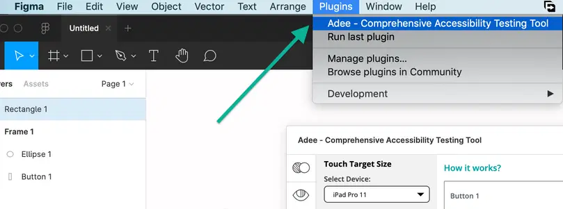
Plugin Installation:
Open Adee plugin from plugin menu > Select the touch size tab (hand icon).
Plugin in Figma and Sketch menu
Touch target size tab in Adee
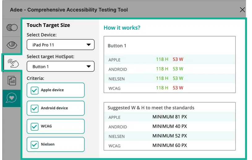
Select a device
From the drop down menu select a device you want to test your touch target size in it. There are a variety of devices based on what is available on the design tools such as Figma, Sketch and Adobe Xd. Currently, this list is divided in two categories of Android devices and Apple devices. It's recommended to try various type of devices for testing your touch target size.

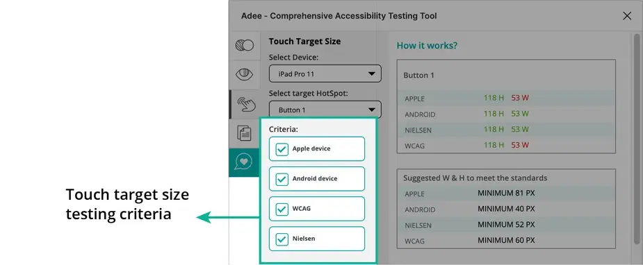
Apple devices:
According to Apple developer guideline (Human Interface Guidelines), designers should try to maintain a minimum tappable area of 44pt x 44pt for all controls.
Android devices:
Android accessibility help recommends making touch targets at least 48x48dp.
Nielsen:
According to Nielsen group, designers should ensure that all interactive elements are at least 1cm × 1cm (0.4in × 0.4in) in physical rendered size.
WCAG:
According to WCAG, Success Criterion 2.5.5 Target Size (Level AAA): The size of the target for pointer inputs is at least 44 by 44 CSS pixels. There are some exceptions you can find in this WCAG page.
Test results:
The image below shows in summery what Adee touch target size checker does afterwards and what you can learn from your test:
As it is mentioned in the guidelines such as Android accessibility help, designers needs to consider that touch targets consist of the area that responds to user input. Touch targets extend beyond the visual bounds of an element: An element like an icon may appear to be 25x25dp but the padding surrounding it comprises the full 48x48dp touch target.